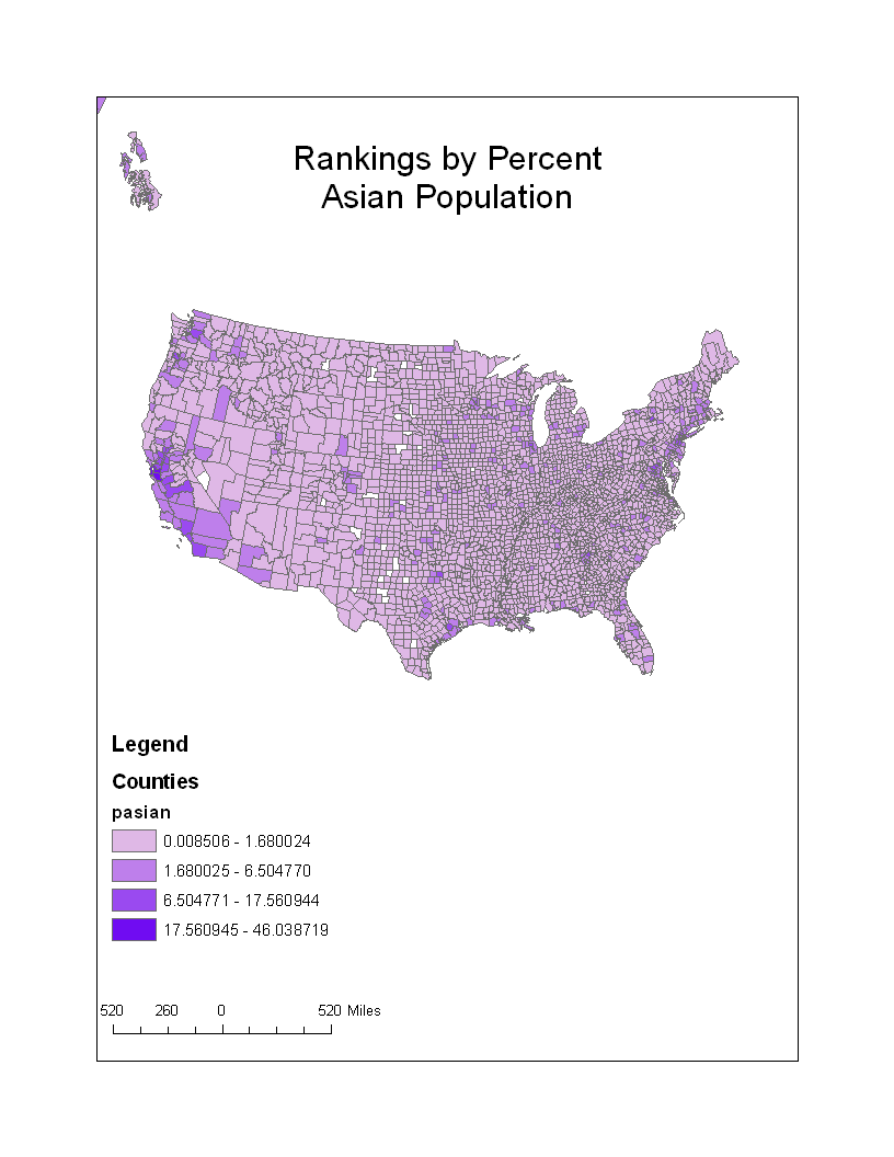
Judging by what the data on the map shows, it seems like the percent Asian population is concentrated in the western side of the United States, most particularly in the mid-portion of California. From there, the Asian population seems to spread down into the rest of Southern California quite constantly. As far as the overall percent Asian population is concerned, it is significantly small in the Mid-West. The Asian population seems to be more concentrated around the South-Western and North-Eastern Coasts.

According to this map, the distribution and concentration of the percent Black population is quite different from that of the Asian population. There is a significant concentration of the Black population in the eastern and mainly south-eastern side of the United States. Throughout the rest of the United States, the percent black population is scattered and becomes a little more concentrated in Southern California, but never as much as it is on the south-eastern side.

This Some Other Race map shows a much bigger concentration of the percentage of that population in just one side of the United States, not found in the other two population maps. Clearly, the some other race percentage is quite concentrated starting from the north-west, down to the south-west, spreading all the way out into the mid-west. Surprisingly, from thereon into the east, the percent Some Other Race population declines significantly.
Rather than just merely judging what the map series shows by analyzing each map individually, it is important to analyze all three of them as a whole. The main reason for analyzing and judging it as a whole is found in the difference of percentage range present in each one. Out of all three of them, the black population had the biggest percentage ranging from its minimum percent of 0.010289 all the way up to its maximum percent of 86.488706. This helps explain why the concentration of a certain percentage of population of race in one part of a map does not necessarily mean that there is necessarily a bigger population of that race in that area and/or overall. The percent data present in each map was all relative in accordance to each one of the three percent race populations individually, rather than all of them together. For example, although the percent Asian Population in the West seemed to be much more concentrated than the percent Black Population, according to the data provided by the maps, there were actually more Blacks than Asians in those very same "Asian-concentrated" areas. It is our responsibility to keep this in mind when analyzing and drawing conclusions from these census maps.
In this lab, GIS is used to make three separate layers of data using three different tables to create three different census maps. GIS very conveniently allows the user to switch between map data to have a better visual understanding of different kinds of data through a varying range of patterns. As far as the actual transfer of data from the US Census 2000 website was concerned, GIS made it especially useful in that the user did not have to manually insert the data into the ArcMap him/herself. GIS made the process very efficient and quick in that it allowed the user to copy excel tables from the Census website, make a few adjustments, and finally add them, with just the click of a button, as data to ArcMap. In addition, by copying the exact data from the website almost directly into ArcMap, there was a decrease in the amount of error in the final displays of each map created.
No comments:
Post a Comment